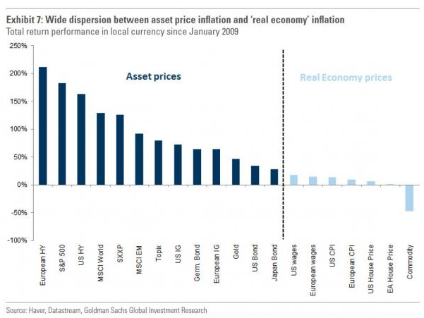
One of the big points I’ve hit on for a while is the wild divergence between what’s going on in the “real” economy and what’s going on in the asset markets. I somehow missed this chart from Goldman Sachs the other day, which looks at just how ridiculous things have gotten. In sum, everything to the right of the dotted line is a “real-world” gauge of improvement or lack thereof since the Great Recession … where everything to the left is a “fantasy land/asset market” gauge of improvement. Pretty staggering to see how much central bank policy has benefitted junk bonds, stocks, gold, and government bonds (Wall Street) … but done hardly anything for wages, inflation, or even house prices (Main Street).

