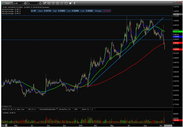
Last week, I talked about the major moves we’ve been seeing in bonds. But we’re also seeing some MONSTER moves in the currency markets. Check out this chart of the Japanese yen, for instance. It was one of my favorite “longs” for most of the year. But I closed out all my recommended yen positions not too long ago, and it’s really starting to crack now. You can see yen futures just plunged through the 200-day moving average, essentially “following” the moves we were already seeing in bond ETFs. Other foreign currencies like the euro are also getting walloped.
Up until first thing this morning, this was seen as bullish for the Dow. But oil and energy shares are starting to roll over now, following the bearish path laid out by gold and gold miners, as well as emerging market stocks, before them. Keep an eye on this. If we “lose” the support of energy shares, I don’t think the averages will handle that very well, especially considering that the averages have already “lost” technology.


{ 1 comment… read it below or add one }
Mr. Larson,
It is said a picture is worth a thousand words.
How many words is your picture (screenshot) in your post worth? To me, Joe Average Investor? Answer? Almost none. Just a pic of lines going up and down. Why? The axes are not labeled, the colored lines are not defined, the units not denoted. Simple as that.
At the bottom of the page there is this statement: “Weiss Research, Inc., founded in 1971, has a long history of providing research and analysis designed to empower investors with information and tools to make more informed, independent decisions along with an equally long history of public service.”
Is your picture post consistent with that Mission Statement?
I conclude, NO. Every map has a legend for good reason. Without it, it is nearly worthless, and decisions and conclusions made from it fraught with error. So too, your screenshot. Your post is for someone else, the erudite economic intelligentsia perhaps who know all about “reading” a screenshot on a sophisticated computer program at just a glance. That is not me. That is not the vast majority of investors.
It comes down to who really IS your audience? Is this Facebook, Twitter……???? Are your postings just for those “in the know”. Or is it something with a wider purpose?
Granted, your post is not alone in failing to label graphs properly at Money and Markets. Failure to label graphs is the rule, not the exception.
I challenge Money and Markets to consider this oversight. Yes, the whole lot of you.
I challenge you to fulfill your Mission Statement and actually communicate to the mass of investors who have neither the erudition nor the tools that you have at your disposal: to actually teach them to make independent decisions. You cannot do that by assuming that they know what you know, as you amply demonstrate with your unlabeled screenshot.
Or maybe you think I’m just interested in a pretty picture or industry chatter, here-say, and gossip? Prove me wrong. Bridge the gap.
Sincerely, Richard Tanner